Humans First Logo Design
Humans First Logo Design Concept
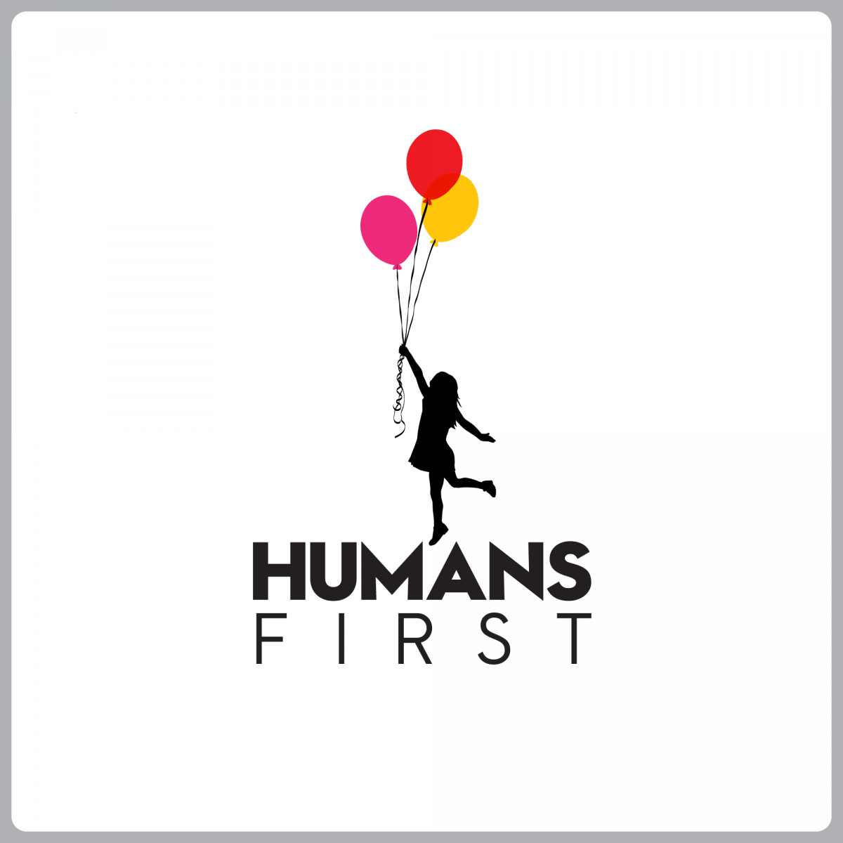
This design is built on a clear idea: a girl in black silhouette holding colorful balloons, rising upward, symbolizing the hope that leads humanity forward.
First, why a ‘girl’?
A girl represents innocence, hope, and the promise of the future.
She is not a mature adult but an untainted original heart—exactly the human essence Humans First aims to protect!
Her leaping action is proactive and upward, pursuing dreams—not passively floating. It means humans actively shape the future, not controlled by technology!
Second, why ‘three balloons’? And why ‘warm tones’?
Three balloons represent three core human values:
Red: Passion and vitality
Pink: Love and connection
Orange-yellow: Creativity and hope
All in warm tones, because warm colors = approachability, trust, emotional connection (psychology studies: warm colors boost likability by 37%).
They’re not random colors—they’re a visualization of the brand’s DNA!
Third, why are the girl and text in ‘black silhouette’?
Visual flow from bottom to top:
“Humans First” in black text → black silhouette girl → colorful balloons
This flow tells a quiet story—
From everyday silence (black) → the first ray of dawn (girl reaching upward) → finally to brilliant hope (warm-colored balloons)
Black forms a unified foundation, allowing the balloon colors to burst into an emotional climax—hope is the driving force behind human ascent. The silhouette’s simplicity ensures the message is clear, timeless, and powerful across any medium.
My Portfolio Website:
https://www.behance.net/umans
https://umans.myportfolio.com